When you think of a map, I guess north is up, south is down, east is right and west is left, right? Did you know this is just one way of making a map? And did you know that no map can accurately represent the whole world?
The problem with maps is that they to try to represent something that is three-dimensional and round (the Earth) on a flat surface. Try to peel and orange, and make the peel flat, without creating any gaps. It’s not possible! That is why there are hundreds of map projections, and none of them are 100 % accurate!
The “standard” map (that we are most used to seeing) uses the Mercator projection. The Mercator preserves direction, but not size. The good thing is that locations which lie north-south and east-west of each other is correctly placed on the map relative to each other. This makes it good for navigation, which is why i.e. Google Maps use it. But look at how much bigger Mercator makes Greenland look, compared to Africa:
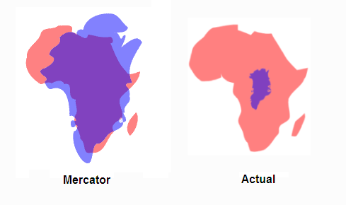
Size of Greenland and Africa in a Mercator map vs in reality. The real size of Greenland is actually only about 1/14 of the size of Africa. (Source: Reddit, u/Asuros)
On a Mercator map, the farther north/south you go, the more things are stretched out. Why? The Earth is round, so the circumference of the Earth, parallel to the equator, decrease the farther north/south you go from the equator (the thickest part). So on the top and bottom of these maps, the map have to stretch out much more (left-right) the Earth to make the north/south lines correct.
And if you go far north/south, almost to the poles (which are really just one small point), they have to stretch along the whole edge of the map:
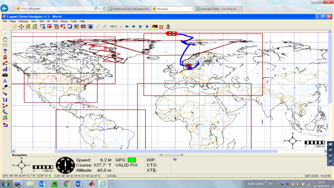
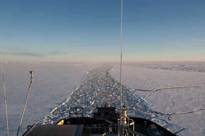
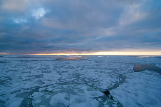
Mercator, you’re of no use for me anymore up here.
The Mercator is used a lot because it’s useful for navigation, the errors are small when you use it for navigation on a small scale (like in cities), and it is usually not a big problem because very few people ever go this far north or south and need directions on Google Maps. But sometimes you need to make maps of the Arctic or Antarctic regions, though.
Enter the polar stereographic map projection, where the north/south pole are in the middle! This means that at one latitude, all distances are correct, and the further away you move, the more distortion you get.
When I first saw these maps, it took some time to get used to. But now, I think they are beautiful!
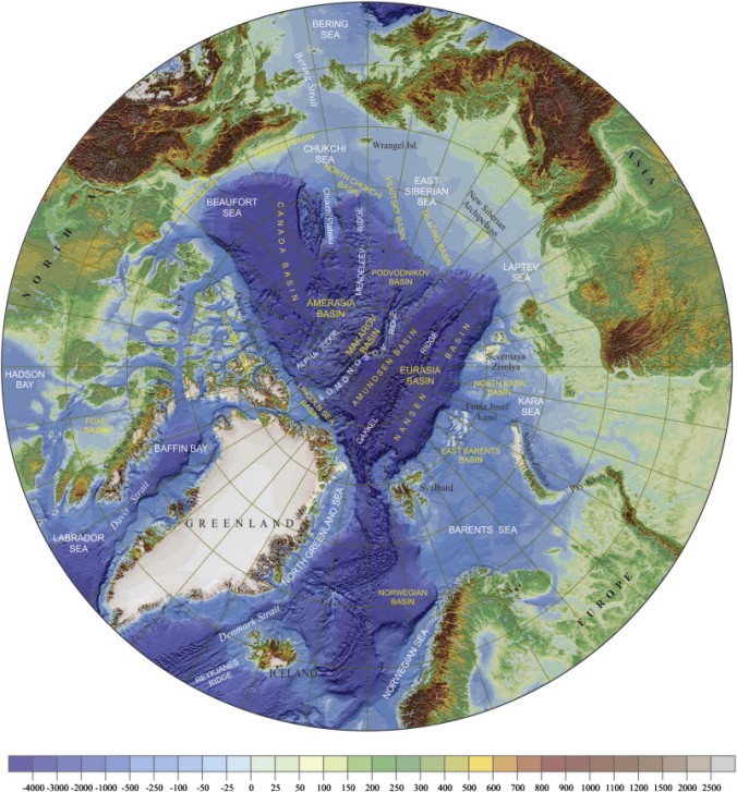
Topography (height of landscape) and bathymetry (depth of ocean) of the Arctic region in a polar stereographic projection. [1]